Wright & Ditson Racket Dating
First Published September, 2012
Updated January, 2026
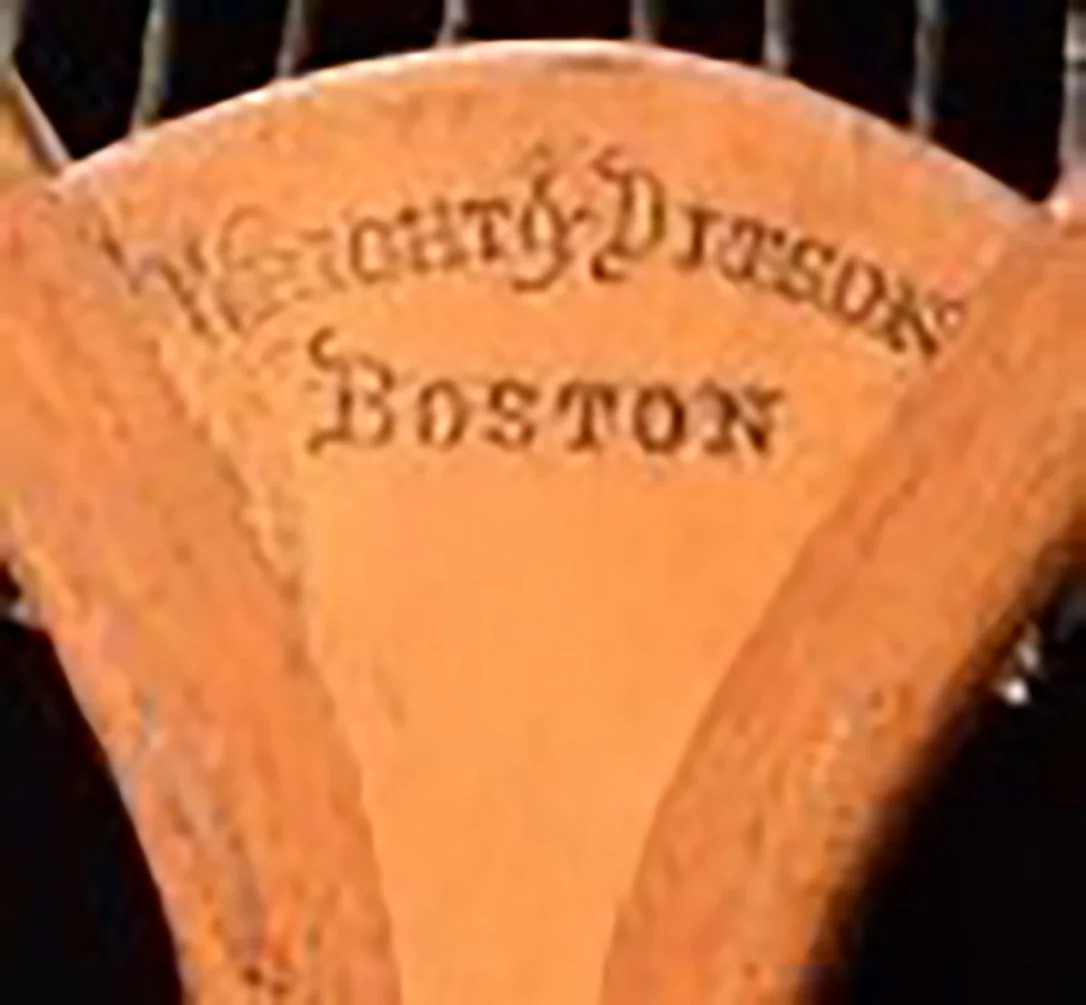
Circa 1880-1890: Logo 1. The initial Wright & Ditson mark was a simple incised stamp. The typeface chosen had pronounced serifs. I have also seen this mark on early tilt tops where the top line "Wright & Ditson" was parallel to the bottom "Boston" line, instead of arched as shown here.
When George Wright and Henry Ditson merged their two Boston sporting goods companies together in 1878 they created a company that quickly became the dominant lawn tennis goods manufacturer in the U.S., which continued even after A.G. Spalding purchased a partial interest in Wright & Ditson in 1891. Over the years, they used several different maker’s marks on their rackets. In order to roughly date their rackets, I have compiled this five photo guide for dating Wright & Ditson rackets.
The dating, which is based on advertising and examination of the actual racket characteristics, is approximated into five or ten year increments. Keep in mind that there were overlapping periods when two consecutive logos were used in the same year. However, the actual order of the logos as they were chronologically introduced is 100% accurate.
The time period covered begins from Wright & Ditson's entry into the tennis market around 1880 into the 1930s. In 1936, Spalding purchased the remaining half of Wright & Ditson that it didn't already own and from that point forward they used the Wright & Ditson name sparingly into the 1950s when they phased out the brand altogether.
Good Collecting.
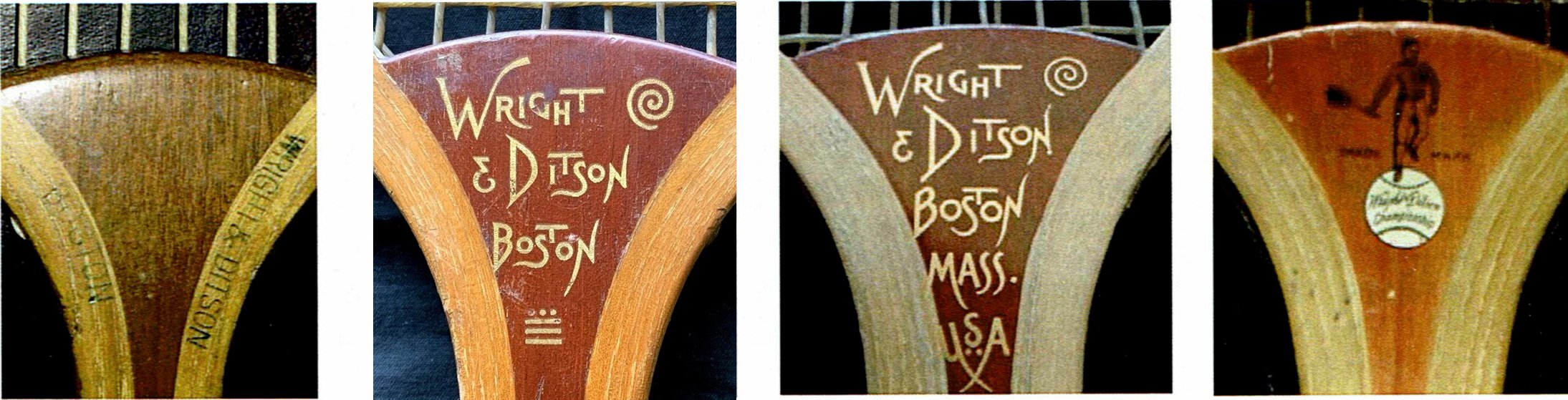
Circa 1890-95: Logo 2 (left). This mark simply has "Wright & Ditson" and “Boston" incised perpendicularly in block lettering on both sides of the throat.
Circa 1895-1900: Logo 3 (second from left). This was the first logo that was stenciled, rather than stamped, into the wood. The three lines and three dots at the bottom are unique to this logo.
Circa 1900-1905: Logo 4 (second from right). This logo, also stenciled, added "Mass. U.S.A." under “Boston" from the previous mark. It does retain the swirl design in the upper right.
Circa 1900-35: Logo 5 (right). The ubiquitous "Man on a tennis ball" logo was first introduced on the flip side of rackets that were marked with Logo 4. Then beginning with the run of distinctive orange convex wedge rackets, such as "The Star" and "The Favorite", it was used as the primary Wright & Ditson logo into the 1930s.